All docs pages
The HeatMap Tab
The HeatMap tab is your core view. It shows one gamma panel per symbol — SPX, SPY, QQQ, and optionally IWM — so you can read where dealers are positioned across the whole board in a few seconds, without hunting.
- One panel per symbol: spot price, day change, a key-level chip row, then strike rows.
- Row color shows relative gamma concentration — brighter rows are stronger levels; yellow leans positive, purple leans negative.
- 👑 Flow King marks the biggest nearby level; * marks the peak strike each side; 📈 flags a volume surge.
- Hover any strike for the full readout, split call vs put.
- Panels update on a rolling cadence (about every 2 minutes). Press R to refresh now.
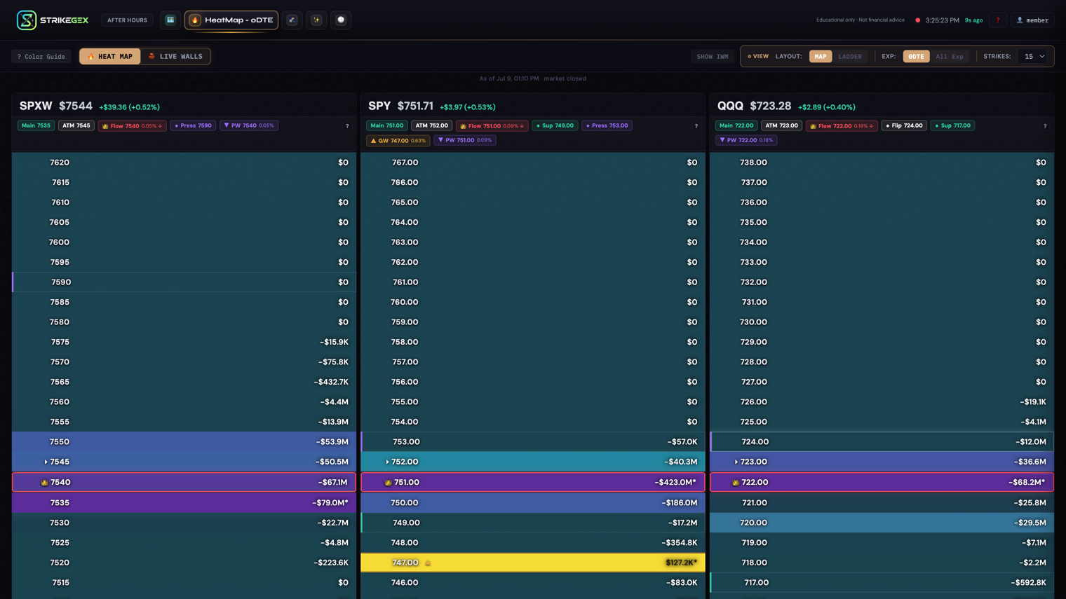
Everything here is educational — a map of where dealer hedging tends to create support, resistance, and magnets. It is not financial advice or a trade signal. For the market-structure theory behind the levels, follow the Learn links at the bottom.
What one panel shows
Each symbol gets its own panel, stacked left to right. A panel has three parts, top to bottom:
- Header — the symbol, the current spot price, and the day change in dollars and percent (green up, red down).
- Key-level chip row — a compact strip of the levels that matter right now (below).
- Strike rows — one row per strike near spot, colored by gamma concentration, with the gamma value on the right.
The SPX panel is labeled with the SPXW weekly symbol because that is the contract series it tracks. Each strike's GEX shows as a dollar figure, abbreviated with a K, M, or B suffix, with a minus sign on negative-gamma levels. Read the numbers relatively: a bigger figure, and a brighter row, means a stronger level. Compare rows to each other rather than reading any single figure in isolation.
Read a panel in 10 seconds
- Glance at the header. Is the day green or red, and how far from flat?
- Find spot. The row nearest the current price sits in the middle, marked as the spot row.
- Find the crown. The 👑 row is the King strike — the largest nearby gamma concentration, the level price tends to gravitate toward.
- Scan the color. Bright rows are the levels traders watch; dimmed rows are background noise. Yellow above/below spot flags a positive-gamma wall; purple flags a negative-gamma zone.
- Read the chip row for the exact King, wall, and nearby levels, with each one's distance from spot.
The key-level chip row
The chips summarize the important strikes so you don't have to eyeball them. Each shows the level and, where relevant, its percent distance from spot.
| Chip | What it marks |
|---|---|
| 👑 Flow | The Flow King — the largest nearby flow concentration. Price may gravitate toward it. Shows percent distance and an ↑/↓ for above or below spot. |
| Main | The best nearby level combining flow strength, structure, and distance from spot. |
| ATM | The strike nearest the current price. |
| ▲ GW | Gamma Wall — a dealer resistance zone above spot (positive gamma — a level that tends to cap and dampen). |
| ▼ PW | Put Wall — a dealer support zone below spot. |
| ◆ Flip / Sup / Press | Nearby landmarks: a possible gamma flip level, a support level, or a resistance/pressure level. |
Tap the small ? next to the chips for the same plain-English legend inside the app.
Strike rows and their markers
Color intensity is relative: the strongest strikes stay bright, weaker ones dim toward the background so a small-volume strike doesn't masquerade as a wall. On top of color, a few glyphs call out specific rows:
- 👑 — the King strike. If the King is off the visible window, a banner at the top or bottom points to it (👑 King … ▲ above or ▼ below).
- * — a peak marker on the strongest positive strike and the strongest negative strike in view.
- 📈 — a volume-surge marker (the row also gets a cyan right edge) flagging unusual activity at that strike.
- A small colored +N% / -N% chip on the strike label. In the 0DTE view this reads as bulls or bears gaining control at that strike over the last several minutes; in other modes it reflects how the level has shifted against its recent baseline. The exact meaning depends on the active view mode — see View Controls & Heatmap Views.
Two bright, stacked rows near spot are worth more attention than one lone bright row far away. Stacked concentrations act as stronger floors and ceilings — see GEX as Support and Resistance.
Hover a strike: the full readout
Move your cursor over any strike row and a tooltip shows everything behind that level, split call vs put:
- Net GEX, Call GEX, Put GEX — the gamma at that strike, net and by side.
- Call OI / Put OI and Call Vol / Put Vol — open interest and volume per side.
- Call Bid/Ask / Put Bid/Ask — current quotes from our live options feed, when available.
- Call IV / Put IV and Call Δ / Put Δ — implied volatility and delta per side.
- From Spot — the strike's distance from the current price, in points and percent.
If the row is the King, the tooltip title carries the 👑 too, so you always know which level you're inspecting.
The Show IWM toggle
By default the tab shows SPX, SPY, and QQQ. Small-cap breadth (IWM) is optional so the board stays uncluttered.
| Control | What it does | When to use it |
|---|---|---|
| Show IWM | Adds the IWM panel to the board. The button then reads Hide IWM to remove it. Your choice is remembered next time you open the tab. | Turn it on when you're watching small-cap breadth alongside the majors; leave it off to keep three clean panels. |
Loading and unavailable states
When the tab first opens, or right after a refresh, panels show Loading GEX Data... while the data comes in. It normally fills in within a few seconds.
If the feed can't be reached, the panel switches to Data Unavailable with the message Could not load GEX data. and a Retry link. Click Retry to reload.
Outside market hours, or during a brief feed hiccup, a panel may sit on the loading or unavailable state — that's the data being missing, not a level reading of zero. Don't trade off an empty or half-loaded panel; refresh with R or Retry and confirm the panel repaints first. See Data & Freshness.
Common questions
- Why is one panel bright yellow and another mostly purple?
- Yellow rows lean positive gamma (a level that tends to pin and dampen moves — a mean-reverting tape); purple rows lean negative gamma (a level where moves tend to extend — a momentum tape). The two panels are just showing different symbols in different regimes. See Gamma Walls Explained.
- Most rows look dim. Is the data broken?
- No — dimming is deliberate noise suppression. Only the strongest few strikes near spot stay bright so the levels that matter stand out. A dim row is a real strike with little relative gamma there.
- What's the difference between the Flow King chip and the Main chip?
- The 👑 Flow King is purely the largest nearby flow concentration. Main blends flow strength, structure, and how close the level is to spot — so it can point to a slightly different, more "tradeable" strike. When they line up, the case is stronger.
- Why does the SPX panel say SPXW?
- SPXW is the weekly SPX option series the panel tracks. It's the same underlying you know as SPX — just the contract label.