All docs pages
StrikeChart: Levels on Price
StrikeChart draws the session's gamma structure — the dealer-positioning levels you already read on the HeatMap — directly on live price candles. Instead of a level list beside the chart, you watch price walk into the King and the walls in real time, and see whether each touch holds or breaks.
- Nodes on candles: gamma concentrations painted as dots over the price bars — brighter, bigger dots are stronger levels (compare them to each other, not to a unit).
- Strike Ledger gutter: a price-aligned strip on the right showing each strike's relative gamma, sharing the chart's exact price axis.
- Level lines: the King, the call wall, the put wall, and the flip level drawn across the chart.
- Approach strip: a one-line live readout — Spot, King, Wall ▲, Wall ▼ — with distance and, when live, a trend arrow.
- Replay + 🔔 Alerts: scrub the session back, or get notified when price nears a level.
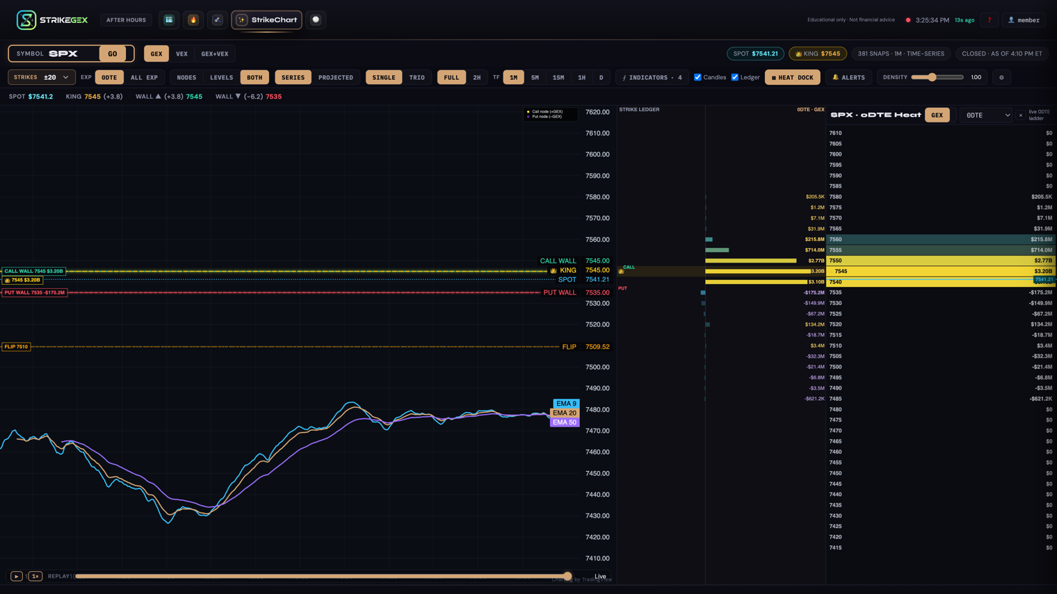
StrikeChart shows the same levels as the HeatMap, plotted on price instead of listed. Everything here is educational — a map of where dealer hedging tends to create support, resistance, and magnets. It is not a trade signal or financial advice. For the theory, follow the Learn links at the bottom.
Load a symbol
- Type a ticker in Symbol (defaults to SPX) and press GO or Enter.
- The chart draws the price candles for the session, with gamma nodes and level lines over them. If nothing's loaded yet you'll see the empty state: StrikeChart — GEX Nodes, Options-positioning nodes painted on price through the session.
- Check the freshness chip in the header. During market hours it reads As of <time> ET; after the close it reads Closed · as of <time> ET; if data lags while the market is open it turns amber: ⚠ Delayed · <time> ET.
The header also carries a Spot chip and a 👑 King chip so you always know the current price and the dominant level at a glance.
The three things you're looking at
Node dots on the candles
Each dot is a strike's gamma concentration, placed at that strike's price on the y-axis. Bigger and brighter means a stronger relative level. GEX magnitudes here are compact and unitless — read them against each other, not as a dollar figure. Yellow-gold leans positive gamma (a level that tends to pin and dampen moves — a mean-reverting tape); purple leans negative gamma (a level where moves tend to extend — a momentum tape).
The Strike Ledger
The Strike Ledger is the gutter on the right. It lists strikes top-to-bottom on the same price axis as the candles, so a level in the ledger lines up exactly with where price would meet it on the chart. It's the HeatMap's strike column, welded to the chart's price scale. The Ledger appears in single view when there's room; the Ledger checkbox hides it to give the chart full width.
Level lines and the approach strip
In Levels or Both style, StrikeChart draws a horizontal line at each level, labeled on the price axis: 👑 KING (the dominant level), CALL WALL (a positive-gamma resistance zone), PUT WALL (a support zone below), FLIP (the gamma flip), and SPOT (the current price). Each wall and the King also carry a small pill on the left edge with the strike and its relative gamma. As price tests a line, StrikeChart tracks whether the touch holds (price deflects away) or breaks (price closes through and stays through).
The approach strip above the chart is the live one-line readout of that interaction: Spot and its price, then King, Wall ▲ (nearest wall above), and Wall ▼ (nearest wall below), each with its distance from spot in points. When you're live (not replaying), a small trend arrow shows whether that level is building or fading. Scrub into replay and the strip prefixes ⏸ Replay with the timestamp you're viewing.
Controls
The primary row picks what you look at first; the secondary row tunes it. Your choices are remembered next time you open the tab.
| Control | What it does | When to use it |
|---|---|---|
| GEX · VEX · GEX+VEX | Exposure to paint as nodes — gamma, vega, or both layered together. | Stay on GEX for the walls you trade; add VEX as a second layer when watching volatility positioning. |
| Strikes ±5…±40 / Auto | How many strikes out (± around spot). Drives both the chart's price range and the Ledger. | Tighten to ±5/±10 for a 0DTE close-up; widen or use Auto to keep the session's whole travel in view. |
| Exp: 0DTE · All Exp | Which expiry surface the levels come from. This changes which King you see — the 0DTE flow King or the all-expiry King. | Use 0DTE for intraday scalps; All Exp for the broader positioning picture. |
| Nodes · Levels · Both | Chart style: the full node field, clean level lines only, or both together. | Levels for an uncluttered read of the King and walls; Nodes or Both to see the whole gamma field. |
| Series · Projected | Time behavior — plot the session as it happened, or project the level surface forward. | |
| Single · Trio | One chart, or SPX / SPY / QQQ side by side. | Trio to scan the majors at once; Single for detail (the Ledger and approach strip are single-view only). |
| Full · 2h | Time-axis zoom. The right edge stays pinned to the live (or replay) edge. | 2h to zoom the recent action; Full for the whole session. |
| TF: 1m · 5m · 15m · 1h · D | Candle resolution. 1m paints the full per-snapshot node field for today's session; higher timeframes step back over several days and lean on the level lines instead. | Stay on 1m for the intraday node field; step up to 1h or D to see the walls across a longer stretch. |
| ⨏ Indicators | Add standard chart studies over the candles — moving averages (EMA), VWAP, RSI, MACD. The EMA ribbon in the figure above is three of these. | Optional — add the studies you normally read price with, or leave them off for a gamma-only view. |
| Candles · Ledger | Show or hide the price candles and the Strike Ledger gutter. | Hide the Ledger to give the chart full width. |
The Heat Dock
Click ▦ Heat Dock to open a price-aligned mini heatmap beside the chart. Its strike rows share the chart's price axis, so a hot row in the dock sits at the same height as that price on the candles. The dock has its own scope:
| Control | What it does |
|---|---|
| GEX · VEX | Which exposure the dock heatmap shows — independent of the main chart. |
| 0DTE · 0-7 DTE · 0-21 DTE · 0-45 DTE | The dock's expiry scope. It can show a different scope than the main chart on purpose. |
| ✕ | Collapse the dock. |
The dock is deliberately independent. Keep the main chart on 0DTE for today's tape and set the dock to 0-45 DTE to see whether the same price zone also shows a wall in the longer-dated book. Comparing the same price zone across scopes lets you see whether it appears in more than one expiry book — see the Learn links for what that means.
🔔 Alerts
Toggle 🔔 Alerts to be notified when price approaches or breaks the KING, CALL WALL, or PUT WALL. Turning it on asks your browser for notification permission — grant it for pop-up alerts. Even without permission, the matching item on the approach strip flashes when an alert fires, so you still get the in-page cue.
Alerts fire only on live, fresh data during market hours. They're suppressed while you're replaying, when data is stale, in Trio view, or when the market is closed — so you won't get a backlog of alerts when conditions clear. Treat every alert as a prompt to look, not an instruction to act.
Replay the session
The replay bar under the chart lets you scrub back through the session. Drag the slider, or press ▶ to auto-advance; the speed button cycles 1× → 2× → 4×. The label reads Live at the right edge and shows the replay timestamp once you scrub back. Replay only uses data that existed at the point in time you're viewing, so you can study how a level actually behaved as price reached it.
Expert sliders
The Density slider is the master control for the node field's size and intensity. For finer control, the ⚙ button reveals per-attribute sliders. Sensible defaults exist — you rarely need these unless the field feels too dense or too faint.
| Slider | What it changes |
|---|---|
| Density | Overall size and intensity of the node field, in one knob. |
| Node Size | Base scale of every node dot. |
| Min Size · Max Size | The smallest and largest a dot can render — clamps the range so the weakest strikes stay visible and the strongest don't overwhelm. |
| Min Opacity · Max Opacity | How faint the weakest nodes fade and how solid the strongest render. |
| King Opacity | How strongly the King node stands out from the rest of the field. |
Common questions
- My old /chart bookmark opens StrikeChart. Where did the Chart tab go?
- The old Chart tab was folded into StrikeChart's Levels mode. Stale /chart links and bookmarks now land here automatically — switch the style to Levels for the clean line view you're used to.
- Why does the Heat Dock show a different level than the chart?
- By design. The dock has its own GEX/VEX and DTE scope, separate from the main chart. If you set the chart to 0DTE and the dock to 0-45 DTE, they're reading different expiry surfaces on purpose — so you can compare them.
- What's the difference between a level "holding" and "breaking"?
- A hold is when price touches a level and deflects back the way it came — the wall acted as support or resistance. A break is when price closes through and stays through. Replay is the best way to see which happened, and how cleanly. See Gamma Walls Explained.
- The chart is empty or a chip says Delayed. Is it broken?
- Outside market hours the session may not have candles yet, and a lagging feed shows the amber ⚠ Delayed chip. That's missing or late data, not a level reading of zero. Reload the symbol and confirm the chart repaints and the freshness chip is current before trusting a read. See Data & Freshness.